Tag: bar chart

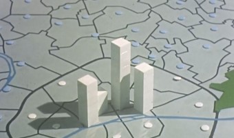
1965 – Stop Motion Animation of Physical 3D Map

This educational movie from the 1960s uses physical bars and stop motion animation to show the evolution of population in the Paris area between 1801 and 1961. It was made between 1962 and 1967 by the Institut des Sciences Humaines Appliquées (ISHA) and the Centre de Mathématique Sociale et de Statistique (CMSS), in collaboration with the Laboratoire de Cartographie directed by Jacques Bertin. You can see the physical visualization from all sides by […]

Added by: Pierre Dragicevic. Category: Passive physical visualization  Tags: bar chart, cartographic, stop motion animation, storytelling


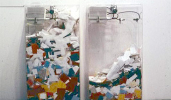
1970 – MoMA Poll: Participatory Bar Chart

German-American artist Hans Haacke created a participatory physical bar chart as part of a 1970 exhibition at the Museum of Modern Art (MoMA). The audience expressed his opinion on the question "Would the fact that Governor Rockefeller has not denounced President Nixon's Indochina Policy be a reason for your not voting for him in November?". The left plexiglass box collected "Yes" answers, while the right box collected "No" answers. Rockefeller was running for re-election and was a major donor […]

Added by: Pierre Dragicevic. Category: Passive physical visualization  Tags: bar chart, participatory, politics


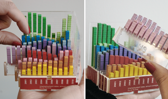
2012 – Rearrangeable 3D Bar Chart

A modular physical visualization like this rearrangeable 3D bar chart allows people to sort, filter, compare and examine data by direct physical manipulation. Sources: Yvonne Jansen and Pierre Dragicevic (2013) An Interaction Model for Visualizations Beyond the Desktop. Also see Yvonne Jansen's PhD dissertation on Physical and Tangible Information Visualization (2014)

Added by: Pierre Dragicevic. Category: Passive physical visualization  Tags: bar chart, rearrangeable


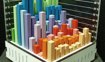
2012 – Putting Physical Visualizations to the Test

These physical bar charts, showing the evolution of country indicators over time, were used to conduct the first empirical study showing that physical visualizations can outperform their on-screen counterparts for data retrieval tasks. Sources: Yvonne Jansen, Pierre Dragicevic and Jean-Daniel Fekete (2013) Evaluating the Efficiency of Physical Visualizations. Also see Yvonne Jansen's PhD dissertation on Physical and Tangible Information Visualization (2014).

Added by: Pierre Dragicevic. Category: Passive physical visualization  Tags: bar chart, study


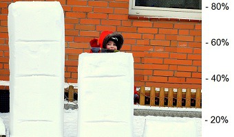
2013 – A Snow Chart of Mobility in Science

A barchar made out of snow. Each bar is a percent of scientist after PhD that changed their university after thesis defence. Source: Przemyslaw Biecek (2013) SmarterPoland.

Added by: Przemyslaw Biecek. Category: Passive physical visualization  Tags: bar chart, snow


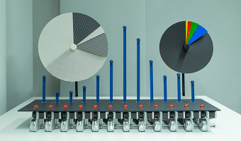
2014 – Dynamic Physical Charts Display Community Data

David Sweeney from Microsoft Research designed these beautiful, mechanically driven, physical charts to communicate data to people living or working on Tenison Road in Cambridge, UK. The charts are part of a research project to explore what is the general public’s understanding of data and how it can be used to improve the life at street level - be that, better access to services, improving social relationships, better engaging with local governance, etc. Beyond making data more eye catching […]

Added by: Yvonne Jansen, sent by: David Sweeney. Category: Active physical visualization  Tags: bar chart, communication, pie chart


2015 – Physical Customer Satisfaction Survey

Participatory physical bar charts at the exit of the Antell cafeteria at the University of Helsinki. White beads represent statisfied customers, red beads are unsatisfied ones. Also see similar contraptions by Hans Haacke (1970), Lucy Kimbell (2006), and Jennifer Payne (2014). Source: Antell. Photo by Luana Micallef.

Added by: Pierre Dragicevic. Category: Passive physical visualization  Tags: bar chart, customer satisfaction, participatory


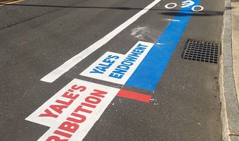
2021 – Walkable Bar Chart

A bar chart conveying two quantities, one of which is clearly larger. The activists and artists at the Respect New Haven rally yesterday offered this stunning graphic to visualize Yale's $32 Billion endowment compared to its paltry $13 million contribution to the city of New Haven...a FRACTION of the taxes it would pay if properly assessed. Also see our other entries on walkable physical visualizations. Source: Tweet from Davarian L. Baldwin.

Added by: Pierre Dragicevic & Yvonne Jansen, sent by: Benjamin Bach. Category: Passive physical visualization  Tags: walkable, city, politics, taxes, bar chart, street, paint