Tag: participatory

500 BC – Pebble Voting

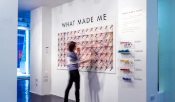
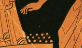
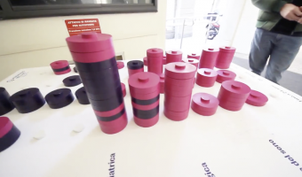
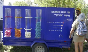
The earliest participatory visualizations were probably voting systems. Voting in Greece was introduced in the 5th century BC. Adult male citizens were invited to express their opinion by dropping a pebble in an urn: a white pebble meant "yes" and a black pebble meant "no". Sometimes two urns were used. The left image is a detail of a Greek wine cup from the 5th century BC, and is one of the earliest known depictions of the act of voting. The middle image is a modern reconstruction from a TV […]

Added by: Pierre Dragicevic. Category: Passive physical visualization  Tags: archaeology, democracy, greeks, participatory, voting


1901 – Davenport's Physical Distributions

In 1901, biologist Charles Davenport "built" physical visualizations that show the distributions of features of objects and people. These visualizations were made out of the objects and the people themselves. The purpose was to explain the notion of statistical distribution to a lay audience. On the left image, seashells are piled up according to how many ribs they have. On the middle image, students are arranged in bins according to their height. On the right image, they are simply sorted. […]


1970 – MoMA Poll: Participatory Bar Chart

German-American artist Hans Haacke created a participatory physical bar chart as part of a 1970 exhibition at the Museum of Modern Art (MoMA). The audience expressed his opinion on the question "Would the fact that Governor Rockefeller has not denounced President Nixon's Indochina Policy be a reason for your not voting for him in November?". The left plexiglass box collected "Yes" answers, while the right box collected "No" answers. Rockefeller was running for re-election and was a major donor […]

Added by: Pierre Dragicevic. Category: Passive physical visualization  Tags: bar chart, participatory, politics


1973 – Mazamet Ville Morte

In 1973, the French town of Mazamet had a population that closely matched the nationwide number of motor vehicule deaths across the previous year. A TV reporter decided to show all inhabitants lying on the floor to symbolize these deaths. Source: Marieaunet (2010) 1973 Mazamet ville morte.

Added by: Pierre Dragicevic, sent by: Charles Nepote. Category: Passive physical visualization  Tags: deaths, participatory, people, rearrangement, single-datum


1991 – Münster Congestion Visualization

In order to encourage bus use, in 1991 the city of Münster, Germany created a poster that compares the space taken by 72 bicycles (left), 72 cars (middle), and a bus (right). This idea is not new. For example, the city of London has made a very similar poster in 1965. Thanks to Will Stahl-Timmins for pointing this out. Sources: Benjamin Starr (2014) How Much Space Do Cars Take? Cyclists Demonstrate How Bicycles Flight Congestion Image from visualnews.com

Added by: Pierre Dragicevic. Category: Passive physical visualization  Tags: city, participatory, people, rearrangement, traffic, transportation


2008 – 100% City

Since 2008, the German theater group Rimini Protokoll organizes performances where they select 100 people in such a way that they form a representative sample of a given city, and then invites them on the stage. Each person briefly introduces themselves, after which everyone participates in a series of physical visualizations where each person takes the role of a data point. The first performance was titled 100% Berlin. Similar performances were then organized in 18 other cities between 2010 […]

Added by: Pierre Dragicevic. Category: Active physical visualization  Tags: city, participatory, people


2008 – Kids Reconstruct Harry Potter's Social Network

At the 2008 science fair (fête de la science), the Aviz group had kids build physical node-link diagrams of Harry Potter's social network using magnets and rubber bands. Source: Aviz. http://www.aviz.fr/old/fetedelascience08/

Added by: Pierre Dragicevic. Category: Passive physical visualization  Tags: education, hand-built, network, participatory, rearrangeable


2011 – Ursus Wehrli's Art of Clean Up

Ursus Wehrli, a Swiss comedian and artist, is known for his parodic art project called "Tidying up Art", where he rearranges well-known paintings in an orderly fashion (see his 2003 book and his 2006 TED Talk). In 2011, he started a project called "The Art of Clean Up" where he rearranges everyday objects and people. Also see our other entries on physical visualizations created by rearrangement. Sources: Maria Popova (2013) The Art of Cleanup: Ursus Wehrli Playfully Deconstructs and Reorders […]

Added by: Pierre Dragicevic. Category: Passive physical visualization  Tags: art, participatory, people, rearrangement


2012 – What made me

An interactive public installation where visitors could engage by picking coloured strings corresponding to feelings, inspirations, thoughts or influences that make the person they are today, and link these strings to words on the wall to make a path visualizing associated concepts tied to each of these feelings, inspirations, thoughts and influences. WHAT MADE ME was designed by Dorota Grabkowska and Kuba Kolec for the Birmingham Made Me Design Expo (15-22 June 2012) at the Mailbox, […]

Added by: Fanny Chevalier. Category: Passive physical visualization  Tags: emotion, graph, participatory


2014 – DIY Bertin Matrix

This wooden matrix is a large-scale replica of Jacques Bertin's reorderable physical matrices. It shows a subset of the World Value Survey, a series of questionnaires that assess people's moral values across countries and years. This physical visualization is interactive as row and columns can be manipulated, promoting engagement and collaboration. This 18x20 matrix was built by Mathieu Le Goc in the Fablab Digscope with Charles Perin and Romain Di Vozzo, on the occasion of the 25th birthday of […]


2014 – Physical Visual Sedimentation

This visualization created by Jennifer Payne and inspired by Samuel Huron's visual sedimentation was created from gumballs, an acrylic (plexiglass) box and adjustable foamcore bin dividers. Huron's work is inspired by the physical process of sedimentation. The above figures illustrate a participatory representation of hours of sleep for a university population, with different colours of gumballs representing different groups present on a university campus (i.e. blue gumballs for graduate […]

Added by: Jennifer Payne. Category: Passive physical visualization  Tags: participatory, visual sedimentation


2014 – Drip-By-Tweet: Each Vote is a Drop

Team of developers Domestic Data Streamers created a real-time physical visualization of votes for a graphic design contest. A person can vote for a specific piece by sending a tweet, after which the machine releases a drop of yellow liquid and sends it to the corresponding test tube. Source: Domestic Data Streamers.

Added by: Pierre Dragicevic. Category: Active physical visualization  Tags: liquid, participatory, streaming, tweets, votes


2014 – Data Strings: Physical Parallel Coordinates

During the SWAB International Contemporary Art Fair, the group of developers Domestic Data Streamers had the audience create a physical parallel coordinates visualization based on their demographic profile (social status, weight, etc.) and by answering a meaningless question on whether they choose a spoon or a fork. Source: Domestic Data Streamers (2014) Data Strings. They have a range of other interesting physical visualization projects on their Web page.

Added by: Pierre Dragicevic. Category: Passive physical visualization  Tags: demographic, nails, parallel coordinates, participatory, threads


2015 – Participatory Representation of Happiness

This 2015 physicalization was part of designer Stefan Sagmeister's exhibit on happiness. It contains a participatory representation of exhibition viewer's happiness, remiscent of Hans Haacke's MOMA poll (1970) and Lucy Kimball's participatory chart (2006). The units which make up the representation are gumballs, like Jennifer Payne's participatory representation (2014). Sources: Stefan Sagmeister (2015) The Happy Show Myles Constable (2015) The Happy Show asked "How Happy Are You? The results […]

Added by: Jennifer Payne. Category: Passive physical visualization  Tags: participatory


2015 – Dan Gilbert's TV Ads

The famous psychology professor Dan Gilbert made a series of TV commercials for the insurance company Prudential, together with Ray Del Savio from Droga5 and Colin McConnell from Prudential. These TV commercials make a clever use of participatory physical visualizations to demonstrate and explain human biases in financial planning. Ribbon Experiment (left image): Dan Gilbert asks bystanders to estimate how much money they will need to retire. He then gives each of them a ribbon and asks them to […]

Added by: Pierre Dragicevic. Category: Passive physical visualization  Tags: participatory, storytelling, walkable


2015 – Physical Customer Satisfaction Survey

Participatory physical bar charts at the exit of the Antell cafeteria at the University of Helsinki. White beads represent statisfied customers, red beads are unsatisfied ones. Also see similar contraptions by Hans Haacke (1970), Lucy Kimbell (2006), and Jennifer Payne (2014). Source: Antell. Photo by Luana Micallef.

Added by: Pierre Dragicevic. Category: Passive physical visualization  Tags: bar chart, customer satisfaction, participatory


2016 – Cairn: Situated Data Collection and Analysis for Fab Labs

Designed within the community of practice of a French FabLab, Cairn aims at understanding the variety of practices within FabLabs. Cairn explores tangible alternatives to questionnaires and other traditional evaluation techniques, and stresses aesthetic and affective dimensions to create an engaging experience. It invites Fablab visitors to reflect on their practices by materializing their activities using small colored woodentiles. Interacting individually with Cairn, people contribute to […]

Added by: Pauline Gourlet. Category: Passive physical visualization  Tags: collecting tool, fab lab, participatory, rearrangeable


2017 – Participatory Matrix and Parallel Coordinates

In order to inform a local audience about a largely-avoided topic such as cancer, a research study was commissioned by KnowAndBe.Live, a startup working in the field of cancer prevention awareness, with the aim of fostering a bottom-up information request from a local audience. The research team included a designer, a sociologist and experts on the topic of cancer-prevention, who worked together relying on a collaborative design approach, with the goal of delineating possible strategies to […]

Added by: Matteo Moretti. Category: Passive physical visualization  Tags: cancer, participatory


2017 – Street Debaters

Japanese designer Tomo Kihara invented a polling device that is both entertaining and profitable. Source: Tomo Kihara (2017) Street Debaters.

Added by: Pierre Dragicevic, sent by: Ryo Suzuki. Category: Uncertain  Tags: coins, homeless, participatory, polling


2018 – Traveling Datavis Game

A public participation project, in which the boundaries of the political debate were discussed. Hoping to define a respectable “clean” political discourse and formulate a treaty reflecting the public's expectations of what constitutes a legitimate discourse based on political ideology or clear up when is a misuse of a public position. The project was made up of an ice-cream truck, driving around Israel periphery, inviting the public to participate in 4 interactive games asking question about […]

Added by: Roni Levit. Category: Passive physical visualization  Tags: participatory, politics


2022 – Edo, a participatory data physicalization of the climate impact of dietary choices

Edo is a participatory data physicalization meant to enable a small community to track the carbon impact of their dietary choices. Each type of food item is represented as a token, a disk, whose surface area encodes the carbon impact of a typical portion of that type of food (data source: Agribalyse). After a meal, one can add data by selecting tokens for all the types of food one just consumed. For example, a burger with fries would require a beef token, a bread token, a salad token, and a […]

Added by: Yvonne Jansen. Category: Passive physical visualization  Tags: participatory, carbon impact, wood