Tag: politics

1970 – MoMA Poll: Participatory Bar Chart

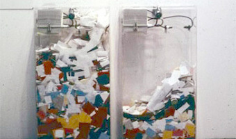
German-American artist Hans Haacke created a participatory physical bar chart as part of a 1970 exhibition at the Museum of Modern Art (MoMA). The audience expressed his opinion on the question "Would the fact that Governor Rockefeller has not denounced President Nixon's Indochina Policy be a reason for your not voting for him in November?". The left plexiglass box collected "Yes" answers, while the right box collected "No" answers. Rockefeller was running for re-election and was a major donor […]

Added by: Pierre Dragicevic. Category: Passive physical visualization  Tags: bar chart, participatory, politics


2009 – Federal Budget Explained with 10,000 Pennies

Political Math (formerly called 10000Pennies on the Youtube channel) is a blogger who criticizes the US policy using stats and low-tech physical visualizations. His first 2009 video titled "Obama Budget Cuts Visualization" (left image) got 1.7 million views. Coins, but also bills, water or whisky stand for units of money or jobs. A video often ends with a dramatic action where the blogger cuts a penny in two, overturns a gallon container, spills hundreds of coins from a table, freezes water, or […]

Added by: Pierre Dragicevic. Category: Passive physical visualization  Tags: budget, employment, politics, storytelling


2012 – Grand Old Party: Political Satire

American designer Matthew Epler shows how to build physical visualizations out of silicone using 3D printing and mold casting. He also shows how to use them to make political statements. Source: Matthew Epler (2012) Grand Old Party (video here).

Added by: Pierre Dragicevic, sent by: Fanny Chevalier. Category: Passive physical visualization  Tags: 3d printing, adult toy, digital fabrication, extruded 2d, moulding, opinion polls, politics, satire, silicone


2014 – Lego Senate

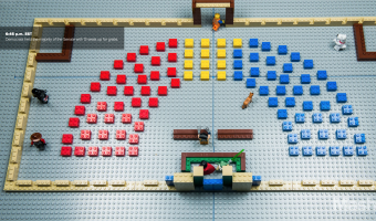
Built by Lance Ulanoff, this Lego representation tells the story of the 2014 US midterms. Red and blue Lego blocks represent the number of Democrat and Republican senate seats. The representation was updated over the evening of the election, as seats went to either Democratic or Republican candidates. Captions tell the story, indicating the time of seat wins and the names of senators. Source: Mashable, The Lego Senate: How the 2014 midterms played out, brick by brick

Added by: Jennifer Payne & Samuel Huron. Category: Passive physical visualization  Tags: LEGO, politics, stop motion animation, storytelling


2015 – U.S. Cost of Political Campaigns

The New York Times has used stacks of Monopoly plastic hotels to explain what the cost of the U.S. political campains means in terms of households. Though closer to concrete scales than it is to data visualization (that usually presents data in a more structured manner), this representation made of physical pieces from the famous board game makes the message particularly compelling. According to the New York Times, Just 158 families have provided nearly half of the early money for efforts to […]

Added by: Fanny Chevalier. Category: Passive physical visualization  Tags: concrete scale, finances, LEGO, Monopoly, politics


2015 – Canadian Federal Election Explained with LEGOs

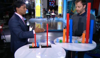
On Canadian national news, Toronto-based artist and organiser Dave Meslin used LEGO bricks to illustrate the results of the 2015 federal election. He shows election results based on a first-past-the-post system, and compares them to a representation illustrating what results would look like if based on proportional representation. Source: CBC News (2015) If Canada had proportional representation: Dave Meslin shows with Lego.

Added by: Jennifer Payne. Category: Passive physical visualization  Tags: LEGO, politics, storytelling


2015 – London Eye Chart: A 135m Tall Donut Chart

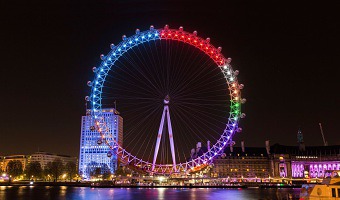
One week before the UK general election of 2015, the design studio Bompas & Parr and Facebook turned the Ferris wheel of London into a giant donut chart of the political parties most discussed on Facebook. Blue stands for the Conservative Party and red stands for the Labour Party. Learn more. Sources: Bompas & Parr (2015) London Eye Chart. Photo by Bompas & Parr.

Added by: Pierre Dragicevic, sent by: Loren Madsen. Category: Passive physical visualization  Tags: large-scale, pie chart, politics, social networks


2018 – Traveling Datavis Game

A public participation project, in which the boundaries of the political debate were discussed. Hoping to define a respectable “clean” political discourse and formulate a treaty reflecting the public's expectations of what constitutes a legitimate discourse based on political ideology or clear up when is a misuse of a public position. The project was made up of an ice-cream truck, driving around Israel periphery, inviting the public to participate in 4 interactive games asking question about […]

Added by: Roni Levit. Category: Passive physical visualization  Tags: participatory, politics


2021 – Walkable Bar Chart

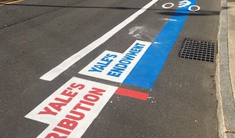
A bar chart conveying two quantities, one of which is clearly larger. The activists and artists at the Respect New Haven rally yesterday offered this stunning graphic to visualize Yale's $32 Billion endowment compared to its paltry $13 million contribution to the city of New Haven...a FRACTION of the taxes it would pay if properly assessed. Also see our other entries on walkable physical visualizations. Source: Tweet from Davarian L. Baldwin.

Added by: Pierre Dragicevic & Yvonne Jansen, sent by: Benjamin Bach. Category: Passive physical visualization  Tags: walkable, city, politics, taxes, bar chart, street, paint