David Sweeney from Microsoft Research designed these beautiful, mechanically driven, physical charts to communicate data to people living or working on Tenison Road in Cambridge, UK. The charts are part of a research project to explore what is the general public’s understanding of data and how it can be used to improve the life at street level - be that, better access to services, improving social relationships, better engaging with local governance, etc. Beyond making data more eye catching […]
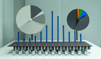
David Sweeney from Microsoft Research designed these beautiful, mechanically driven, physical charts to communicate data to people living or working on Tenison Road in Cambridge, UK. The charts are part of a research project to explore what is the general public’s understanding of data and how it can be used to improve the life at street level - be that, better access to services, improving social relationships, better engaging with local governance, etc. Beyond making data more eye catching and legible, the charts are part of an effort to engage people with their data and enable them to use it to actively participate in communal life. By materialising data using large, mechanically driven charts, the aim has been to produce both a spectacle - that visually appeals to onlookers - and forms of data that people find compelling and want to engage with. Currently, the physical charts are being used to display real-time data on a road in Cambridge. They switch between showing, one, vehicle journey data measured on the road, two, aggregated air quality measurements being recorded by residents, and, three, results from local polls and votes. As such, the charts provide a way for locals to see data that has an immediate relevance to them and that they may use to have some say over improving community life. Overall, the aim of the physical charts has been to work on an approach to data visualisation that weaves data into people’s ordinary lives. The hope is that by materialising the data in the highly visible, legible and dynamic charts, onlookers see it as knitting into daily life, becoming a meaningful and relevant part of how they see themselves, individually and collectively. Sources: Microsoft Research, Physical Charts. Tenison Road Project.