Tag: food

2009 – How Much Sugar do you Consume?

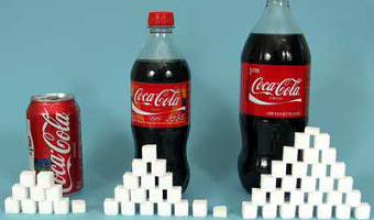
Nutrition labels are often difficult to apprehend: when you drink a can of coke, you consume 39g of sugar, but how much is that? In order to increase consumer's awareness of how much sugar they ingest when eating and drinking, several campains have used a physical visualization using actual sugar cubes and sugar grains to represent the sugar content in food. Many examples can be found online (search for "sugar stacks" and "rethink your drink"). It is unclear when these representations started. […]

Added by: Fanny Chevalier. Category: Passive physical visualization  Tags: concrete scale, food, single-datum, sugar


2009 – S-XL CAKE: Irregular Cake Mold

A cake mold that creates pieces of cake in different sizes. Although not a physical visualization, it could in principle encode data. Source: Ding 3000 via Infosthetics.com.

Added by: Yvonne Jansen. Category: Enabling technology  Tags: food, pie chart


2010 – Cookbook Arranges Ingredients into Physical Visualizations

In Sweden, IKEA gives away baking books where ingredients are arranged into physical visualizations. The photos are by Karl Kleiner. This idea is reminiscent of Ursus Wehrli's art projects. Sources: Niels-Peter Foppen (2010) Hembakat är Bäst. Via Iohanna Nicenboim's pinterest. Images from notcot.com.

Added by: Pierre Dragicevic. Category: Passive physical visualization  Tags: cookbook, food, ingredients, rearrangement, recipes


2012 – Data Cuisine

The left image is a map that shows the differences in alcohol consumption across Finland, as well as typical local food. The right image shows the number of immigrants in Finland by nationality (rice for the Chinese, salmon for the Swedish). Many other examples of edible physical visualizations can be found on the Data Cuisine web site. Data Cuisine is a series of workshops organized by Moritz Stefaner and prozessagenten. Seven workshops took place so far, the first one was in Helsinki in 2012. […]

Added by: Pierre Dragicevic, sent by: Romain DiVozzo. Category: Passive physical visualization  Tags: cartographic, data cuisine, edible, food, world stats


2015 – Multivariate Beer

Nathan Yau from flowingdata brewed four different types of beer based on county demographics. For example, he mapped population density to the total amount of hops, and race percentages to the type of hops used. He describes the process in detail on his web site, with R source code. The idea is reminiscent of Rohit Khot's TastyBeats shown at the CHI '14 conference, an installation that creates personalized energy drinks based on heart beat data. Also see our entry on data cuisine. Sources: […]

Added by: Pierre Dragicevic. Category: Passive physical visualization  Tags: beer, data cuisine, demographics, food


2017 – Popsicles of Pollution

Students from New Taipei City collected samples from urban rivers, creeks and ports which they then froze in moulds and preserved in resin. ‘We hope when more people see this they can change their lifestyles,’ said one of the group. Source: Elle Hunt (2017) Popsicles of pollution: ice lollies highlight Taiwan's contaminated waterways.

Added by: Pierre Dragicevic. Category: Uncertain  Tags: food, indexical, pollution, water