Tag: art

1995 – Loren Madsen's Early Data Sculptures

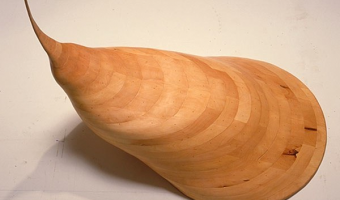
Californian artist Loren Madsen has been making data sculptures since 1995 and still continues today. CPI / Cost of Living (left image) is the first of his series: A lamination is one year. Vertical axis is the Consumer Price Index (CPI) for food; the horizontal axis is the CPI for gasoline + electricity. The rising center line is the CPI for housing. The 'snout' is the 1960's when housing and food were cheap. The bulge above the snout is 1973---OPEC, gasoline lines, etc. Thereafter the cost of […]

Added by: Loren Madsen & Pierre Dragicevic. Category: Passive physical visualization  Tags: art, CPI, data, data sculpture, housing, income, information


1997 – Level: Hans Hemmert's Same-Height Shoes

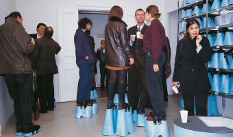
“Level” (1997), Styrodur/rubber/Velcro/measuring device, 50 pairs of platform shoes with heights of 5-43 cm, installation view at Galerie Gebauer Berlin, © Hans Hemmert and VG Bild Kunst. Guests to this installation picked out shoes that brought them all to the height of two meters. The blue height of the shoes served as a physicalization of the height disparities around the room. Sources: Hans Hemmert (1997) Personal Absurdities, Galerie Gebauer Berlin 1997. Interview With Hans Hemmert, 2018 […]

Added by: Nick Marotta. Category: Uncertain  Tags: art, height, measurement, shoes


2007 – Explosion of Sound Sculptures

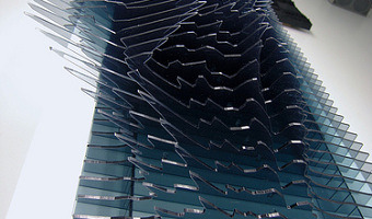
In 2007-2008, sound became an endless source of inspiration for data sculptors. Examples include (images from left to right): Binaural by Daniel Widrig & Shajay Bhooshan (2007) Sound/Chair by Plummer Fernandez (2008) Sound Memory by Marius Watz (2008) Reflection by Andreas Nicolas Fischer & Benjamin Maus (2008) I Will Never Change by Us by Benga (2012) Microsonic Landscapes by Juan Manuel de J. Escalante (2012) The Shape of the Sound of the Shape of the Sound by Stephen Barrass (2012) […]

Added by: Pierre Dragicevic & Yvonne Jansen, sent by: Fanny Chevalier - Benjamin Bach. Category: Passive physical visualization  Tags: art, data sculpture, sound, sound sculpture, temporal data


2011 – Ursus Wehrli's Art of Clean Up

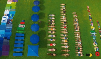
Ursus Wehrli, a Swiss comedian and artist, is known for his parodic art project called "Tidying up Art", where he rearranges well-known paintings in an orderly fashion (see his 2003 book and his 2006 TED Talk). In 2011, he started a project called "The Art of Clean Up" where he rearranges everyday objects and people. Also see our other entries on physical visualizations created by rearrangement. Sources: Maria Popova (2013) The Art of Cleanup: Ursus Wehrli Playfully Deconstructs and Reorders […]

Added by: Pierre Dragicevic. Category: Passive physical visualization  Tags: art, participatory, people, rearrangement


2016 – Woven Chronicles

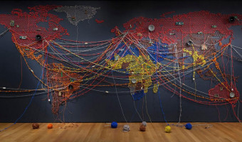
Woven Chronicle is a cartographic wall drawing that, in the artist’s words, represents “the global flows and movements of travelers, migrants, and labor.” Kallat uses electrical wires—some of which are twisted to resemble barbed wire—to create the lines, which are based on her meticulous research of transnational flows. Wire is an evocative and contradictory material: it operates as both a conduit of electricity, used to connect people across vast distances, and as a weaponized obstacle, such […]

Added by: Santiago Ortiz. Category: Passive physical visualization  Tags: art, cartographic, migration, network, wires


2018 – The 20 Year Gap

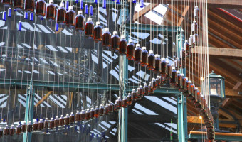
This data physicalization is an art installation that represents the difference in disability-free life expectancy* and overall life expectancy for different areas in the UK, thereby highlighting the unequal health conditions in the country. Each area is represented by a hanging thread. On each thread a red bottle corresponds to disability-free life expectancy while the blue bottle represents overall life expectancy. The title of the artwork refers to the finding that in the UK there is gap of […]

Added by: Petra Isenberg. Category: Passive physical visualization  Tags: art, installation