Bill Gates shared a short video featuring Steven Pinker on his Twitter feed with the comment
People today are living longer, healthier, and happier lives than ever before. I asked @sapinker to explain why.
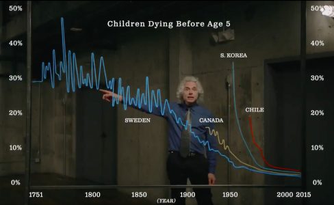
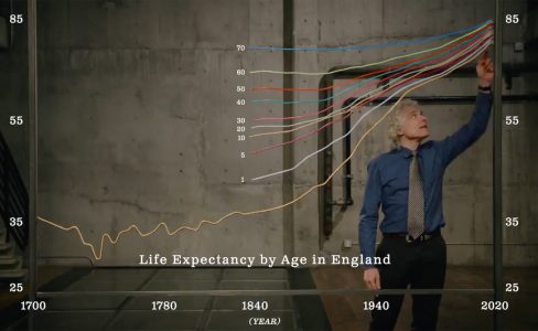
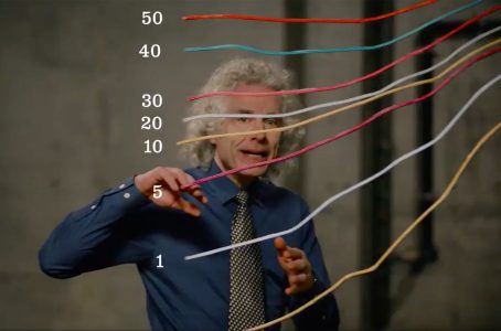
At first glance it appears that line charts are digitally overlaid on the video. However, closeups and a light swaying of the graphs when Steven Pinker touches them, as well as the addition of another country towards the end of the video indicate that the graphs visible in this video are actually physical line graphs.
Also see the entry "Hans Rosling Adopts Physical Visualizations (2010)" which includes links to videos of Hans Rosling and Bill Gates using physical visualizations and props to explain data.
Sources:
- Tweet by Bill Gates, 24/02/2018.
- Direct acces to the video via youtube (posted by Bill Gates, 13/02/2018)