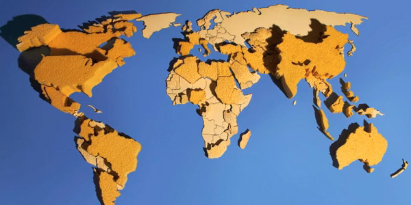
Can We Keep Up is a a physical data visualisation that investigates the domestic need for water in cities all over the world.
Source: infosthetics.com. Image from Hal Watts.
Added by: Yvonne Jansen, sent by: Romain Vuillemot.
Category:
Passive physical visualization
Tags:
cartographic, data sculpture, sponge, water
