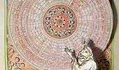
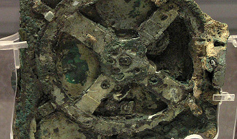
An orrery is a mechanical model of the solar system. The left image shows the Antikythera, the oldest known orrery. The middle image shows a virtual reconstruction. The right image shows a contemporary orrery. The Antikythera mechanism is an ancient analog computer designed to predict astronomical positions and eclipses. It was recovered in 1900–01 from the Antikythera wreck, a shipwreck off the Greek island of Antikythera. The instrument was designed and constructed by Greek scientists and has […]
1200 – Pop-Up and Movable Books
While gatefold mechanisms were already used in the 1100s, one of the first movable paper mechanisms was a volvelle created by Benedictine Monk Matthew Paris to calculate the dates of Christian holidays in his book Chronica Majorca (1236-1253, see left image above). Volvelles are paper discs or rings placed on top of each other that rotate around a string or rivet. Many other types of paper mechanisms have been invented since then, such as flaps, which were used in anatomy books starting from […]
1753 – Barbeu-Dubourg's Machine Chronologique
Before Joseph Priestley published his famous timelines, Frenchman Jacques Barbeu-Dubourg built a 16-meter long timeline showing 140 years of world history, which can be mechanically scrolled and folded for transport. Not a physical visualization but maybe the first “interactive” timeline representation in history. Seen in a talk by Catherine Plaisant. Sources: Stephen Boyd Davis (2009) The First Modern Timeline? Stephen Ferguson (1991) The 1753 Carte Chronographique by Jacques Barbeu Du Bourg. […]
1839 – Théodore Olivier's String Models
Between 1839 and 1853 the French mathematician Théodore Olivier created string models to teach and demonstrate descriptive geometry, some of which could be manipulated. He was a student of French mathematician Gaspard Monge, who invented descriptive geometry and was already illustrating his ideas with rudimentary string models. Photo above: intersection of two cylinders. Sources: Nicholas Mee (2013) Strings, Surfaces and Physics. Photo above taken in the Musée des Arts et Métiers in Paris, see […]
1896 – James Ive's Mechanical Teaching Map
The boundaries of the United States transformed during the 19th century, often through violent means. Mapmaker James Ives created this mechanical map to help people, especially students, visualize these changes. Sources: Leventhal Map Center (2019) Tweet. Boston Rare Maps (2016) Fantastic mechanical map of United States territorial expansion. Video by the Leventhal Map Center.
2011 – Manually Animated Graph of Scientific Data
Philadelphia-based multi-discipline artist Bradley Litwin built this physical chart that can be animated by turning a crank. It is the only manually-animated physical visualization we know of so far. It was commissionned by a pharmaceutical company, intended as an educational device for distributing to doctors. Bradley was kind enough to send us an image of the insides of the original prototype, "not quite as pretty as the final product", he says. His explanation: As the crank is turned, a […]
2013 – Pop-Up Infographics
In 2013, Italian graphic designer Elena Turtas crafted four books that convey data about sustainability using pop-up and movable paper mechanisms. Source: Elena Turtas (2014) The Four Books of Visualising Sustainability.
2020 – Venous Materials
. A team of researchers at the MIT Media Lab developed physical user interfaces based on fluidic channels that can interactively respond to mechanical inputs from the user, without any electrical power. Above, line charts that are activated and animated by pressure input. Also see our other artifacts involving mechanical interaction and physical computation. Source: Hila Mor, Yu Tianyu, Ken Nakagaki, Benjamin Harvey Miller, Yichen Jia, and Hiroshi Ishii (2020) Venous Materials: Towards […]