The movies, it turns out, are a terrible model for data visualization.
Let me step back a moment. If I want to know what the future of, say, intelligent agents might look, I have a lot of choices. KITT from Knight Rider, or the Star Trek computer, or HAL from 2001, or any of a thousand other films and television shows will all give me examples of how speech recognition and intelligent agents might look. A designer of current systems can push back, or pick points on the spectrum—“I’d think it can be more mechanical, less humanoid.”
What about computer graphics? The Holodeck. R2D2 projecting the Princess Leia. Infinite zooming in Blade Runner. 3D worlds in Jurassic Park and a million other movies.
And so it goes for lots of developing technologies. Flying cars and self-driving cars. Robots and tablet computers. Movies have shown us visions of the future for power plants, and long distance transport, and food preparation–and even for how doors might work. Film directors, screenwriters, and effects teams have done a wonderful job of portraying the a computerized, high-technology future.
Now, since the beginning, we’ve all understood that computers are very good at presenting and storing information- Or, at least, we’ve believed that we understand that. Sadly, we have only the poorest of examples to work from.
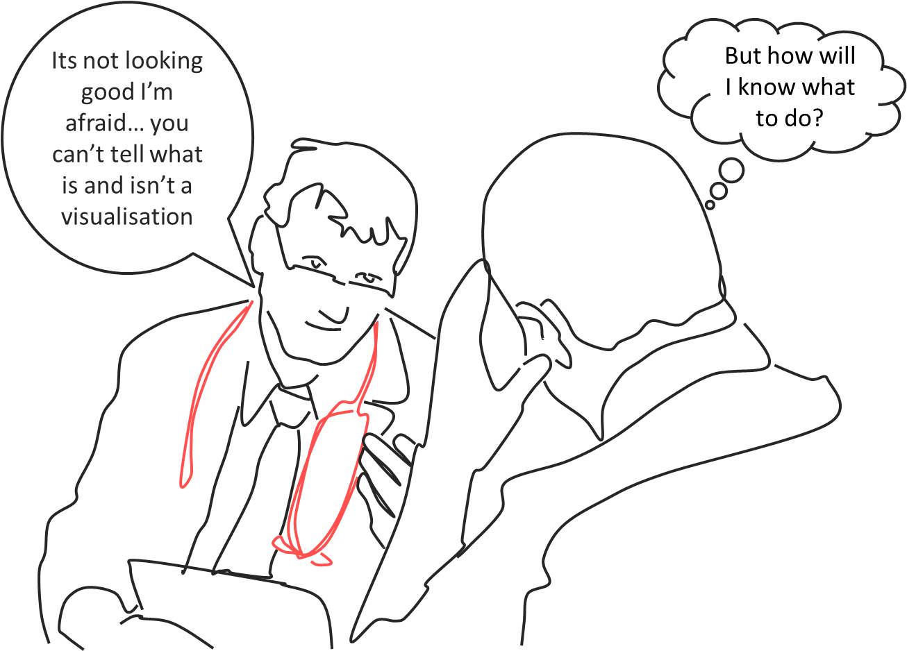
Not long after Minority Report came out, the interface was the talk of the conference. Who wouldn’t want to be Tom Cruise, solving crimes with a stern look and conducting data to the soothing strains of classical music? It took only a few days to notice the flaws—the tremendous physical strength required to use a vertical work surface; the fact that the surface only showed a dozen or so video clips.
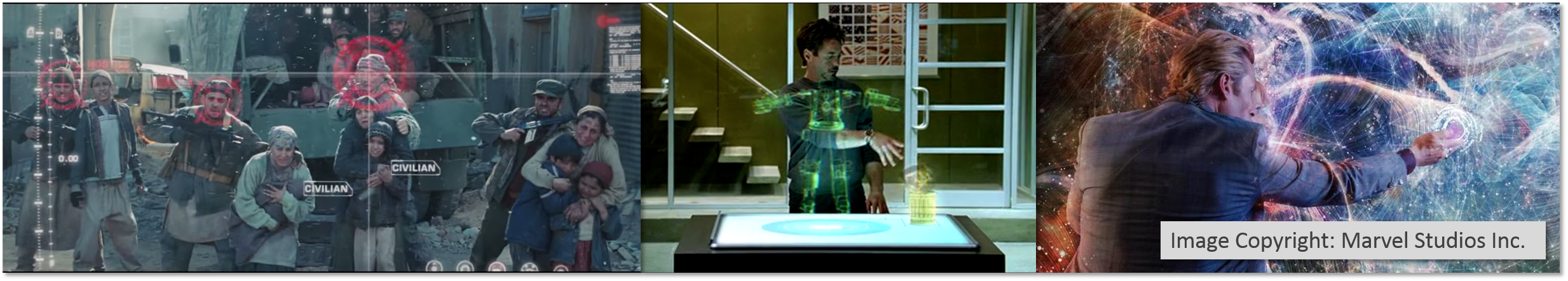
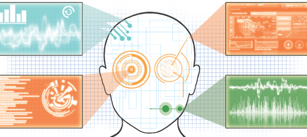
Movies often bring in a ‘visualization’ to show that Real Hard Science is happening: Tony Stark not only manipulates a Periodic Table floating in the air (for completely mysterious reasons), but has a cockpit full of virtual circular bar charts with bouncing indicators.
James Bond casually looks at an information display as M grabs data off the table and throws it onto a wall-size screen. It’s a picture of the villain, a few photographs of his miscellaneous personal belongings, and a map with one spot of color, showing where the next travel montage will bring us. Around the side are unreadable, scrolling text. For extra science, some of the text appears to be computer code.
Data turns to Captain Picard, spouting smooth technobabble while numbers scroll past his screen—and in the Matrix, screens of meaningless numbers scroll past as a character calmly explains that the raw data is easier to read. John McClane (Die Hard 4) takes in the big screen at the CIA, which is filled with meaningless charts, randomly-zooming maps, and one counter, slowly counting down. When the counter goes to zero—we’re certain—terrible things will happen. Batman sits in his cave, watching two hundred independent video feeds at once. Suddenly, the Bat-Computer makes a decision, and every screen changes over to a single scene that moves the plot forward.
There are exceptions: scientific visualization and map-based presentations can be reasonably presented, with approximately one dimension of data. Essentially, the visualization gets to show one fact, such as “it’s over here.”
As soon as we want to represent anything remotely data dense, we need to slow down a great deal. Hans Rosling takes four minutes to show his famous animating charts: it takes a full minute to just explain the axes, another to describe what different areas of the chart mean. Even then, the presentation can only show the very basic decision of “things that are close together” vs “things that are far apart.”
By their very nature, movies will never offer us the technological innovation we might be seeking here. High-quality, expert-oriented data visualization require more time, more precision, and more expertise than a movie screen has time to show us. Movies will continue to simplify visualization to the point of absurdity: spaceships become dotted outlines; blinking lights will streak toward other dotted lines, which will be destroyed in a flash of red. Information visualization researchers, then, need to learn to operate independently from Hollywood; the needs of movies do not speak to our field.
This is a bitter truth to swallow. Our fellows in some other fields of computer science have long since accepted it: representations of OS operations (“I know Unix!” from Jurassic Park; the 3D environment in Disclosure); of programming languages; and even of search engine rankings (searching for “Job”, in the Saint, finds one hit) are all absurd. But to the extent that visualization is informed by design, we wish, I think, to draw inspiration from designers working in different fields, solving different problems. (Then again, infographics are also doing a poor job of informing the field.)
My vision of “beyond the desktop”, then, is a pessimistic one. We know a lot about desktops: how to interact with them rapidly, how to use them efficiently. We have placed enough technology in them to be able to manipulate up to a terabyte of data, which seems to cover many interesting problems; we have connected them to fast networks. While it’s important to be able to build lightweight dashboards for phones, and make data browsable on a tablet, the desktop is a powerful tool.
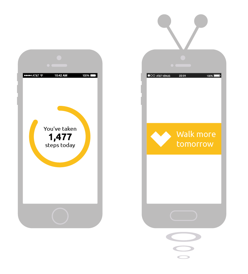
Don’t get me wrong: my work on Cambiera (Isenberg et al) convinced me that touch manipulation can feel smooth and efficient, and has an important place. Fitbits—showing just a few characters and a blinking light—are surprisingly good at motivating lightweight behavior. And I hope that wall-sized displays can provide new forms of richness.
But we’re going to have to get there the old-fashioned way: not through adapting ideas from our imagination, but by writing code, failing, and trying again.


